Property
Lintel
What we delivered
- Brand strategy and positioning
- Identity and visual system
- Fourteen brand applications
- Website design
- Ongoing marketing system
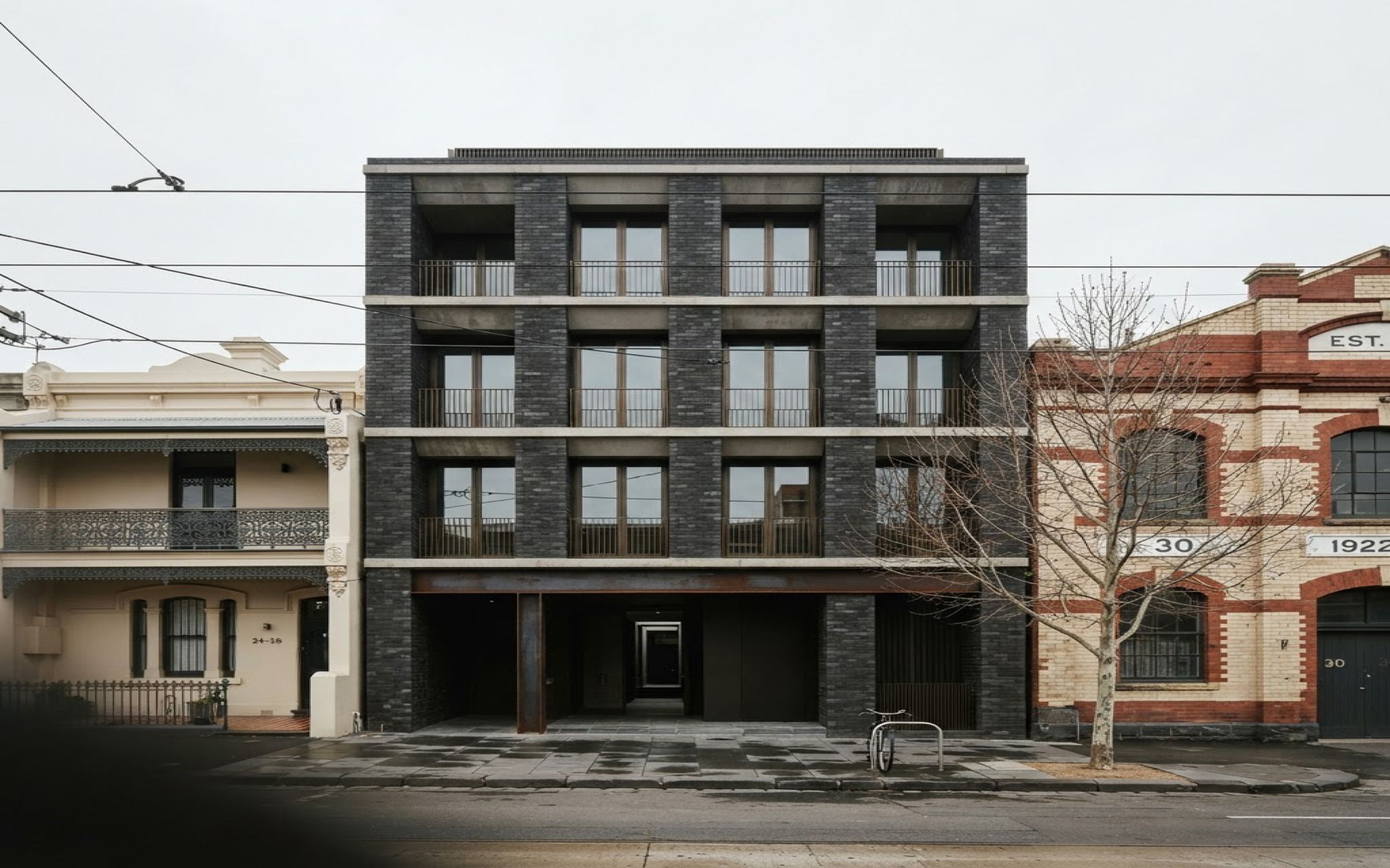
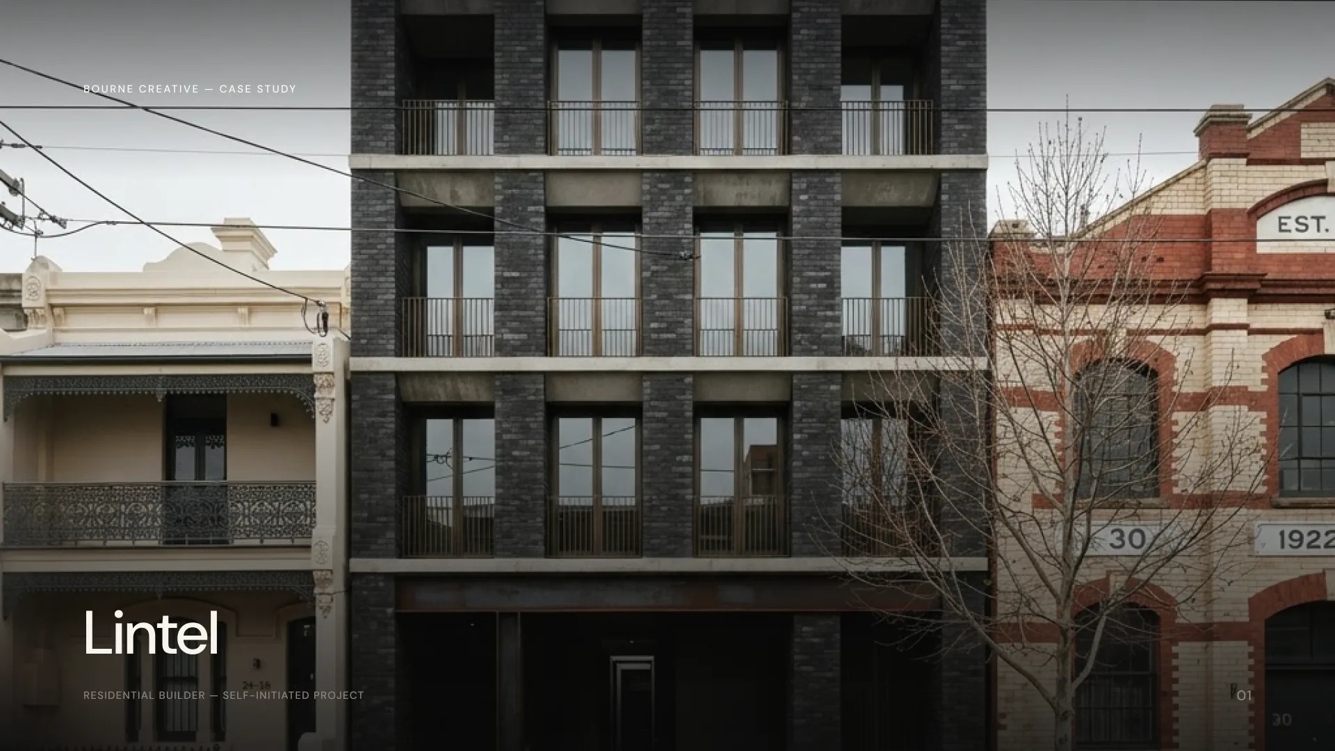
Lintel is a self-initiated Bourne Creative project: a complete brand identity and digital experience for a boutique Melbourne property developer, built to show what the category could look like if it stopped selling a lifestyle. The work covers brand strategy, identity, applications, website and an ongoing marketing system.
Every developer says premium. The category has made the word mean nothing
Boutique development markets itself with twilight renders, champagne glasses and an unrivalled opportunity. The language is interchangeable, which means it carries no information.
The audience for this kind of housing is design-literate. Downsizers who have owned and renovated before, and the architects they ask for an opinion. That audience can read a floor plan and a material schedule. Sold to with the usual vocabulary, they discount the whole thing.
So the brief was to convince without borrowing a single cliché of the category.
The name is the concept
A lintel is the piece that carries the weight and lets the light in.
Honest structure, generous openings, nothing decorative pretending to be structural. That is a description of the buildings and a description of the brand at the same time, which is what a name should do.
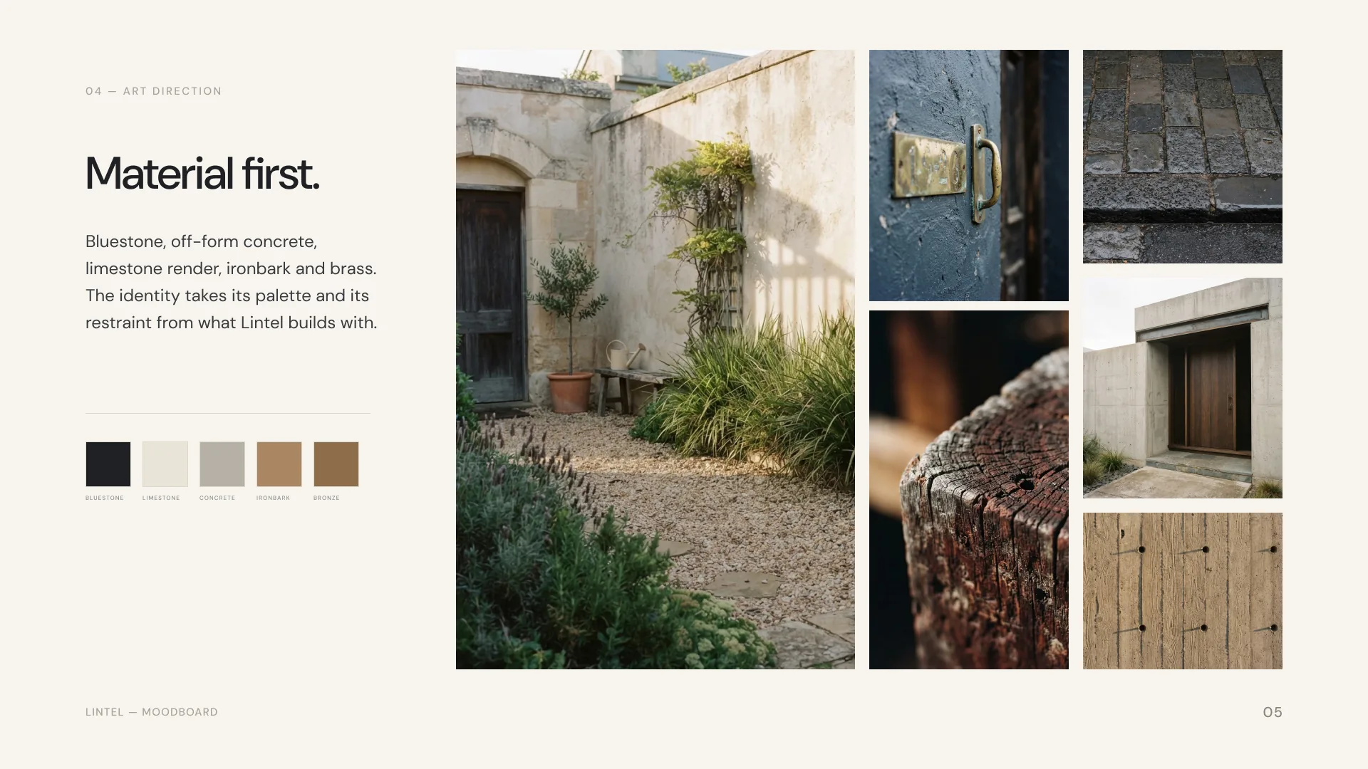
Quarried, not chosen
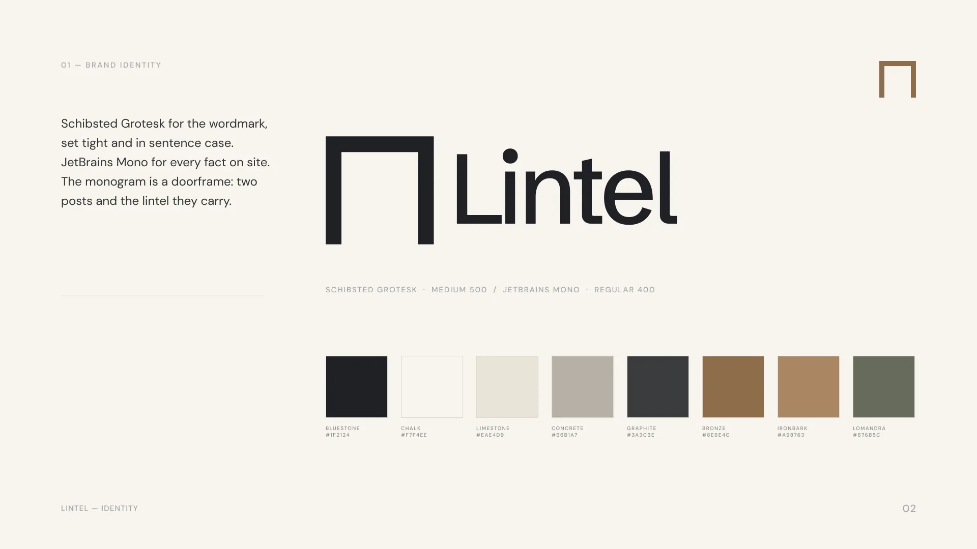
The palette comes from what the buildings are made of. Bluestone kerbs, off-form concrete, ironbark, limestone render. Bluestone carries 60 per cent, chalk 20, limestone 10, with concrete and bronze at 5 each.
Type is Schibsted Grotesk with JetBrains Mono for specification. Numbers, areas, energy ratings and completion dates are set in mono, because in this category the specification is the sales argument.
Ordered by how often the street actually sees them
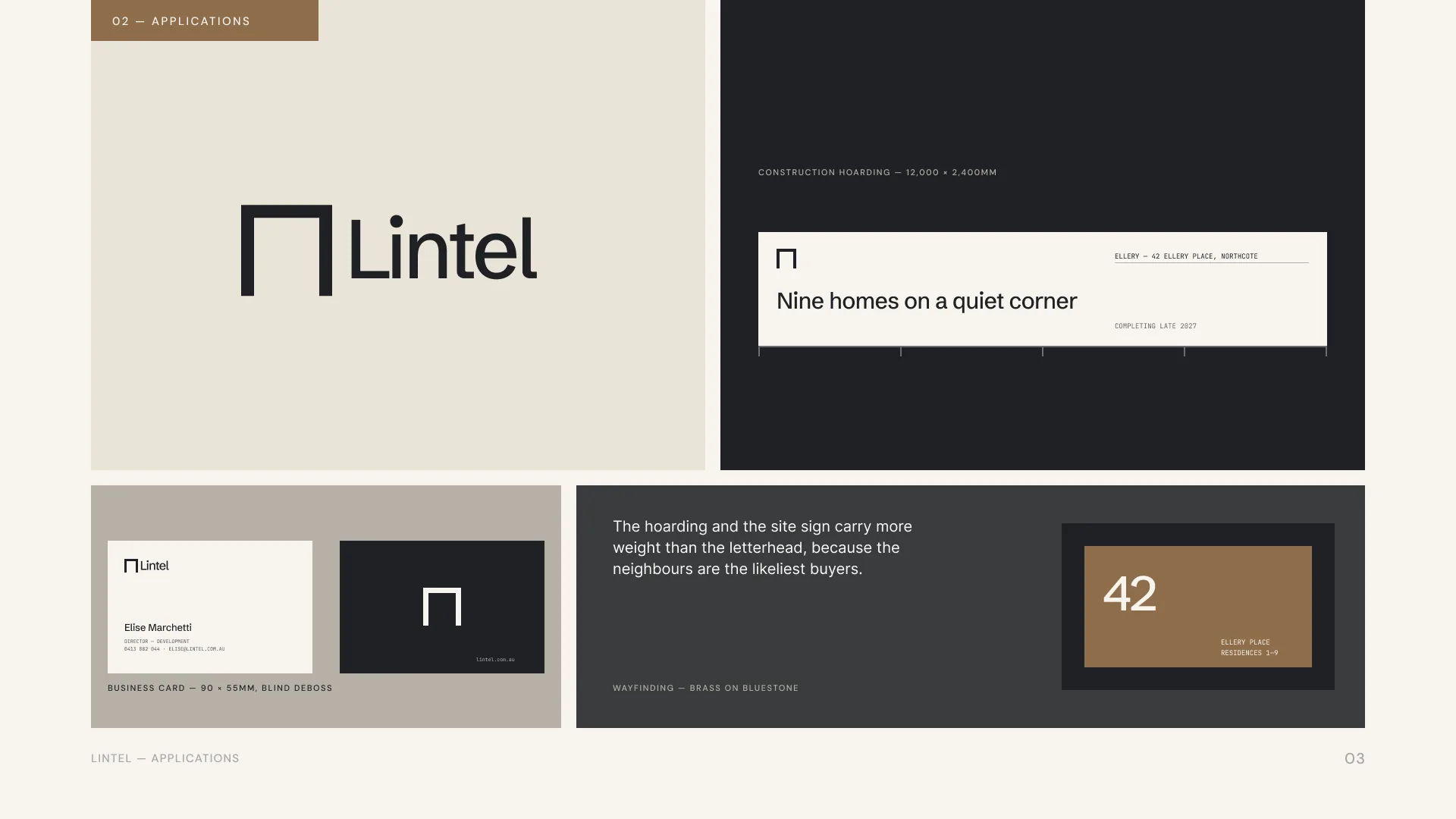
Fourteen applications, sequenced by visibility rather than by convention.
The construction hoarding and the site sign carry more weight than the letterhead, because on a residential street the neighbours are the next buyers. A twelve-metre hoarding is the largest piece of brand communication the project will ever produce, so it was designed first.
Smaller pieces hold the same discipline. A blind-debossed business card. Brass wayfinding on bluestone.
A digital experience for a considered purchase
The website is built for people who will visit it repeatedly over months rather than convert on a first session. Projects, approach, studio and journal, with a single register-interest path running through.
A marketing system that runs on a schedule
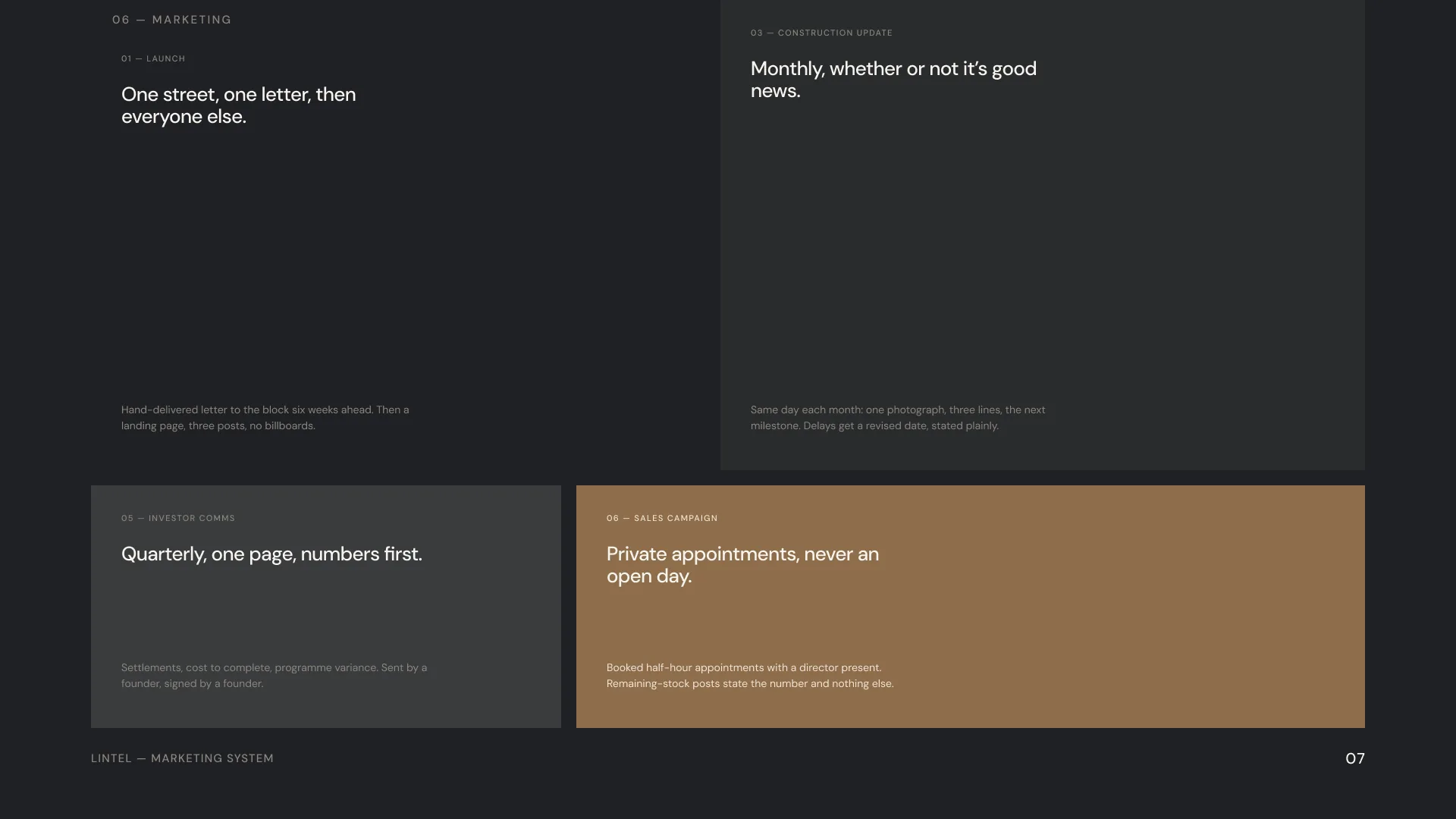
Launch begins with one street and one letter. A hand-delivered letter to the block six weeks ahead, then a landing page and three posts. No billboards.
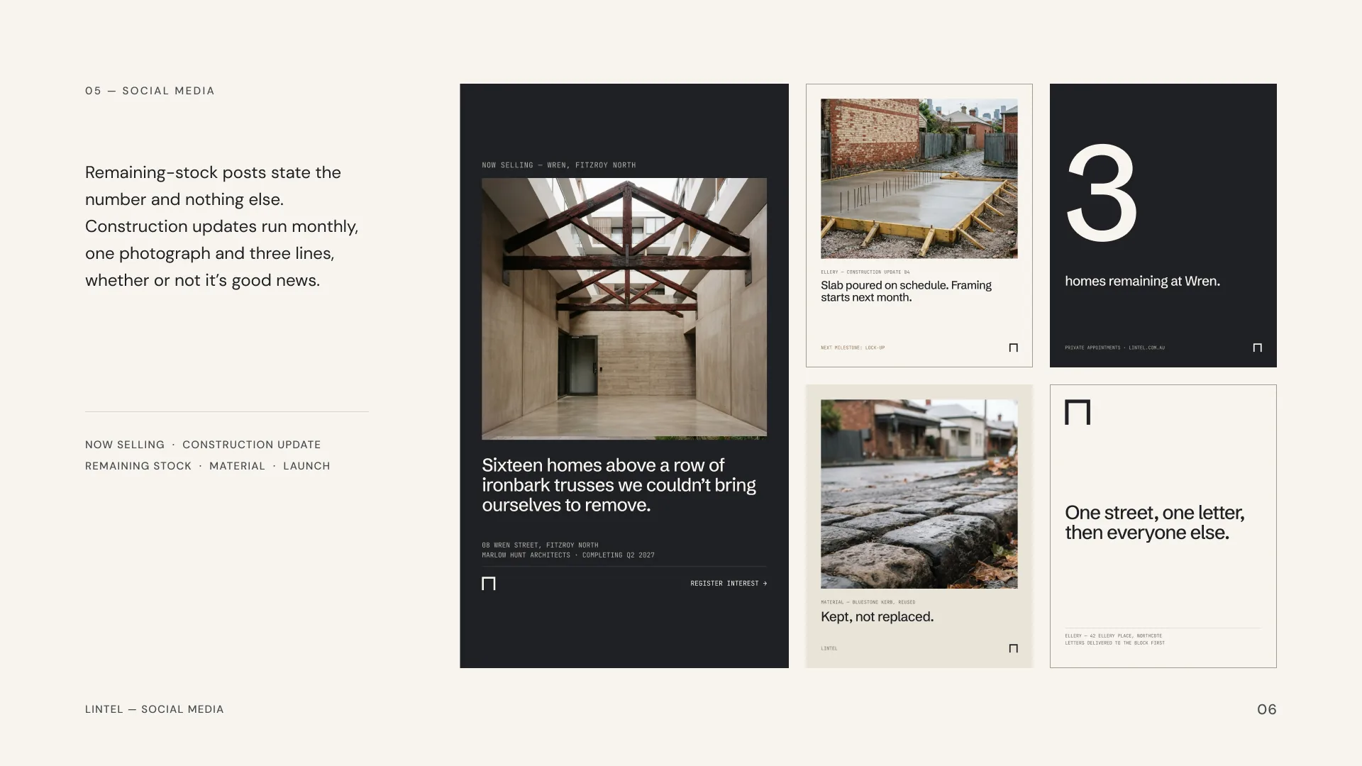
Construction updates go out the same day each month whether or not the news is good. One photograph, three lines, the next milestone. Delays get a revised date, stated plainly.
Investor communications are quarterly, one page, numbers first. Sent by a founder and signed by a founder.
The sales campaign runs on booked half-hour appointments with a director present, never an open day. Remaining-stock posts state the number and nothing else.
Outcome
A developer brand that reads like a materials schedule rather than a lifestyle fantasy.
Lintel is a self-initiated project. It demonstrates the brand strategy, identity, digital experience and ongoing creative support Bourne Creative provides to architecture practices, interior designers, landscape architects and other design-led businesses.
Selected Imagery
“A lintel is the piece that carries the weight and lets the light in.”
Start a Project