Architecture
Mylor


What we delivered
- Naming
- Brand identity and design system
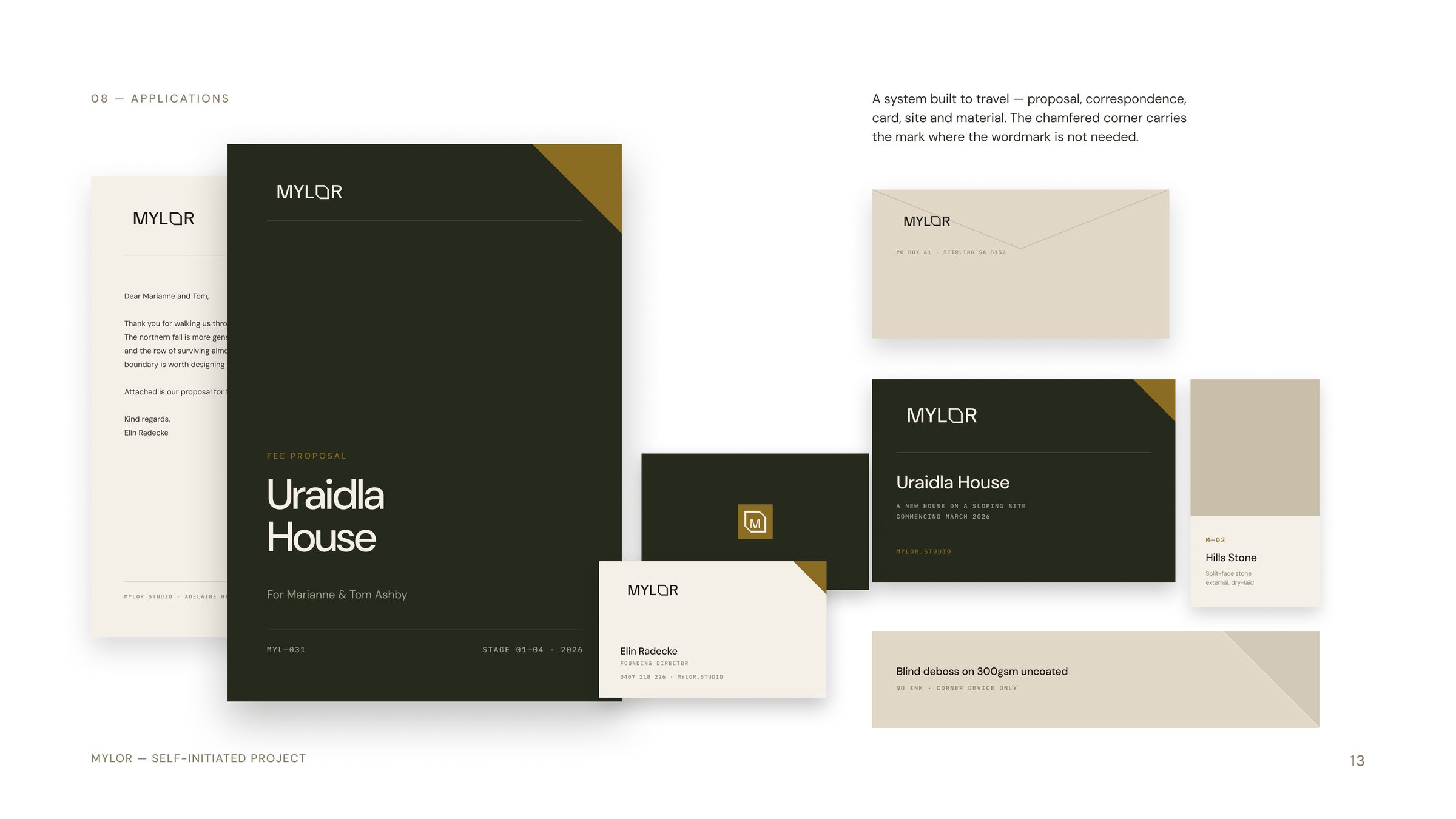
- Collateral and applications
- Website design
- Art direction
Mylor is a self-initiated Bourne Creative concept for an Adelaide Hills architecture practice: six to eight houses and hospitality spaces a year, for people who intend to keep what they build. We developed the name, the identity, the collateral and the website as a demonstration piece for design-led architecture and property clients.
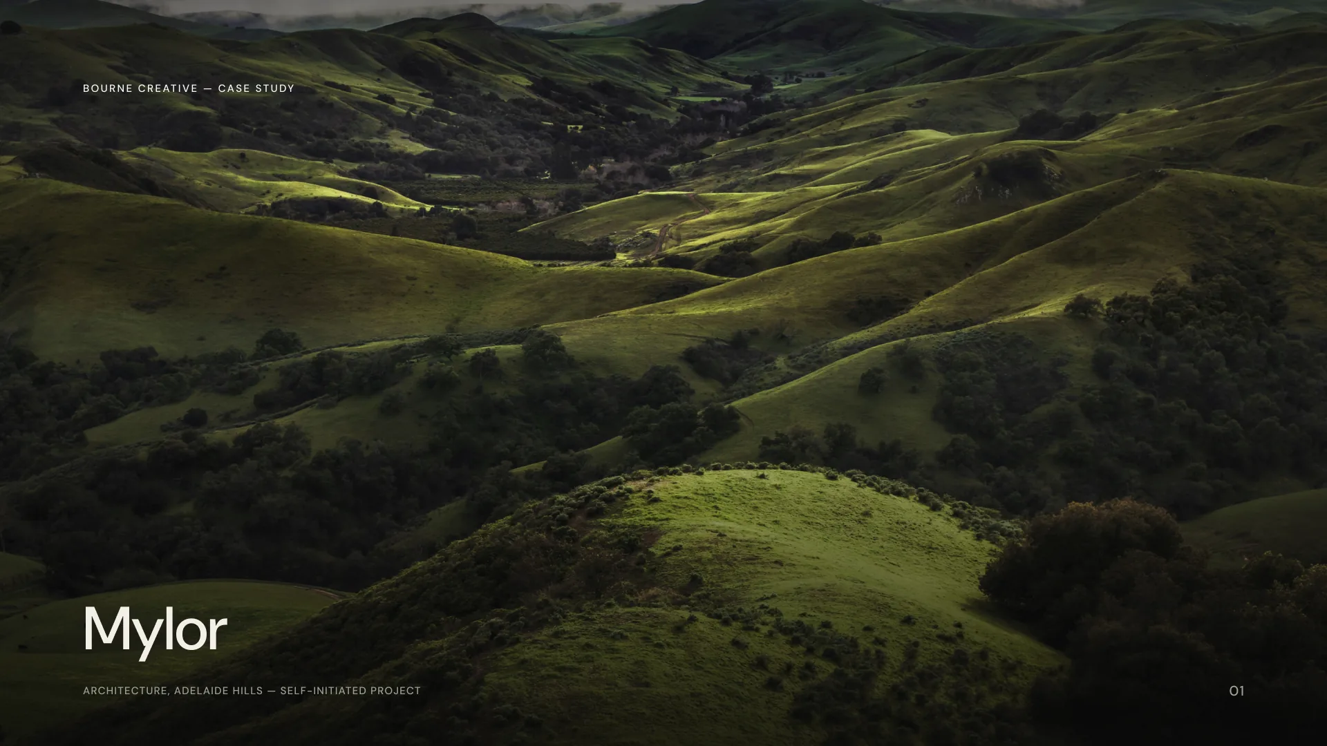
A village in the Adelaide Hills taught the practice how to build
The premise is a practice whose value is longevity rather than volume. A capped project list, a season of site study before design begins, an in-house detail library, and a return visit to every completed building to document how it aged.
Marketing an architecture practice on those terms is genuinely difficult. The proof of the work arrives ten years after the photograph.
The cut corner that stops an edge from chipping
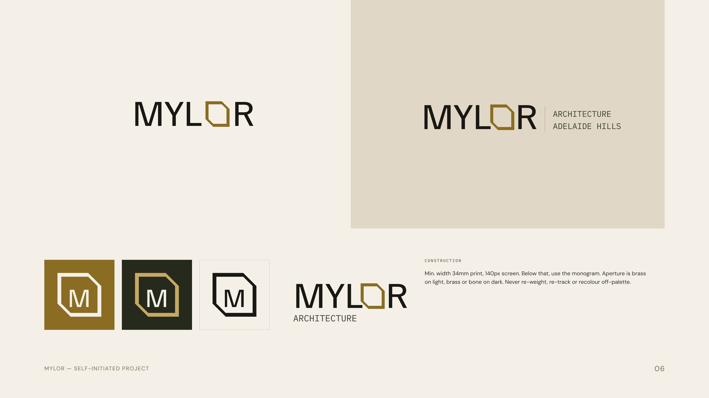
The concept is a 30 degree chamfer, the arris. It replaces the O in the wordmark, in the monogram, on the covers and through the pattern.
It is a detail borrowed from building rather than from graphic design, which is the whole argument. The mark comes from how things are made.
The wordmark is a drawing, not a font setting
Familjen Grotesk, tracked plus ten, with the counter of the O replaced by a chamfered aperture drawn at 30 degrees. Minimum width is 34mm in print and 140px on screen. Below that, the monogram takes over.
Type is deliberately narrow in range. A grotesque, the same grotesque widened, and a mono for numbers. No serif. Nothing is added without removing something.
Two backgrounds only
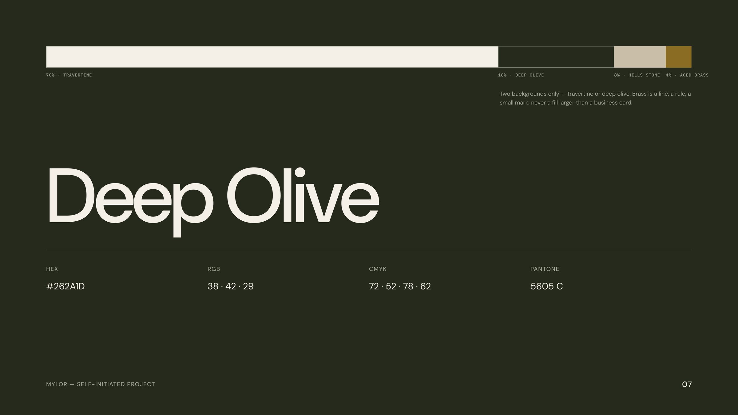
Travertine at 70 per cent, deep olive at 18, hills stone at 8, aged brass at 4. Brass is a line, a rule or a small mark. Never a fill larger than a business card.
Drawing furniture, not decoration
The graphic language is taken from the studio's own documents rather than invented. Datum lines from survey run as a footer band. Scale bars and north arrows are reused as identity. Every project carries an index numeral, so a job is a code rather than only a name.
A website paced like a building
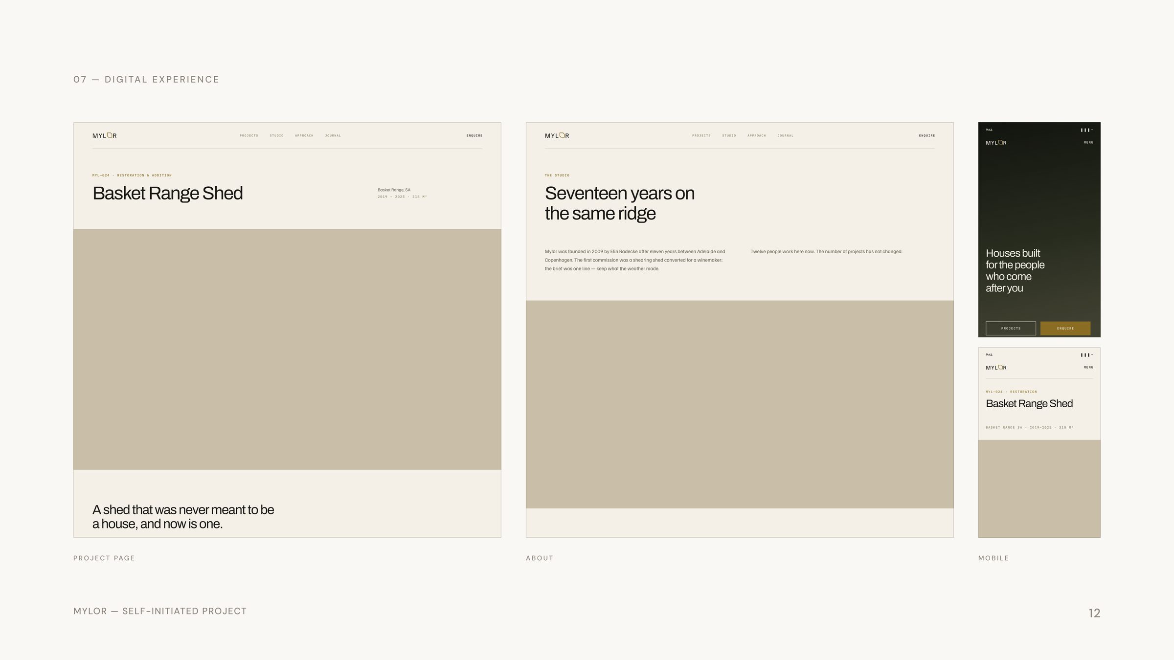
The homepage is a full-length scroll with alternating colour bands setting the pace and a single conversion path throughout. Projects, studio, approach and journal, with project pages built to carry a long-form account of the work rather than a gallery.
Desktop and mobile were designed together, not adapted afterwards.
Art direction
Photograph the weather, not the furniture. The shot list runs to building in landscape, material macro, ambient interior, and hand and detail. Available light only, early morning or the twenty minutes after sunset.
No commissioned photography exists for this project. The art direction is direction, not delivery, and it is presented that way.
Outcome
Not a brief. A proof of practice. Mylor was built to show identity and digital working as one system rather than as two commissions.
Selected Imagery
“A house should be describable in four materials.”
Start a Project