
B2B Consultancy
Second Order
What we delivered
- Brand strategy and positioning
- Visual identity and design system
- Website design and build
- Four master infographics
- Campaign and social template system
What it achieved
5
Deliverable systems
40+
Social templates
3
Canvas formats
Second Order is a B2B systems consultancy. It helps companies understand how their pipeline actually works before they add more tools, software or AI to it. The thinking was rigorous. The presentation was not. Bourne Creative was engaged to build the whole system: brand strategy, visual identity, a website and a content engine the team could run without us.
A category built on jargon, selling a service nobody could picture
Second Order had the strategic depth of a consultancy and the visual presence of a spreadsheet. Every competitor said the same three words.
In a category where buyers cannot picture the service before they commit to it, the brand had to earn credibility before the first conversation rather than during it. The audience was senior, the decision was considered, and the work had to hold up in the room where that decision gets made.
Own the thinking, not the deliverable
We positioned Second Order against the jargon of the category rather than against named competitors. That distinction mattered. Competing on adjectives would have put them in the same sentence as everyone else.
The strategic move was to make the method visible. For a consultancy, the process is the product, so the process had to be something a prospect could read, follow and repeat back to a colleague.
One mark, five states
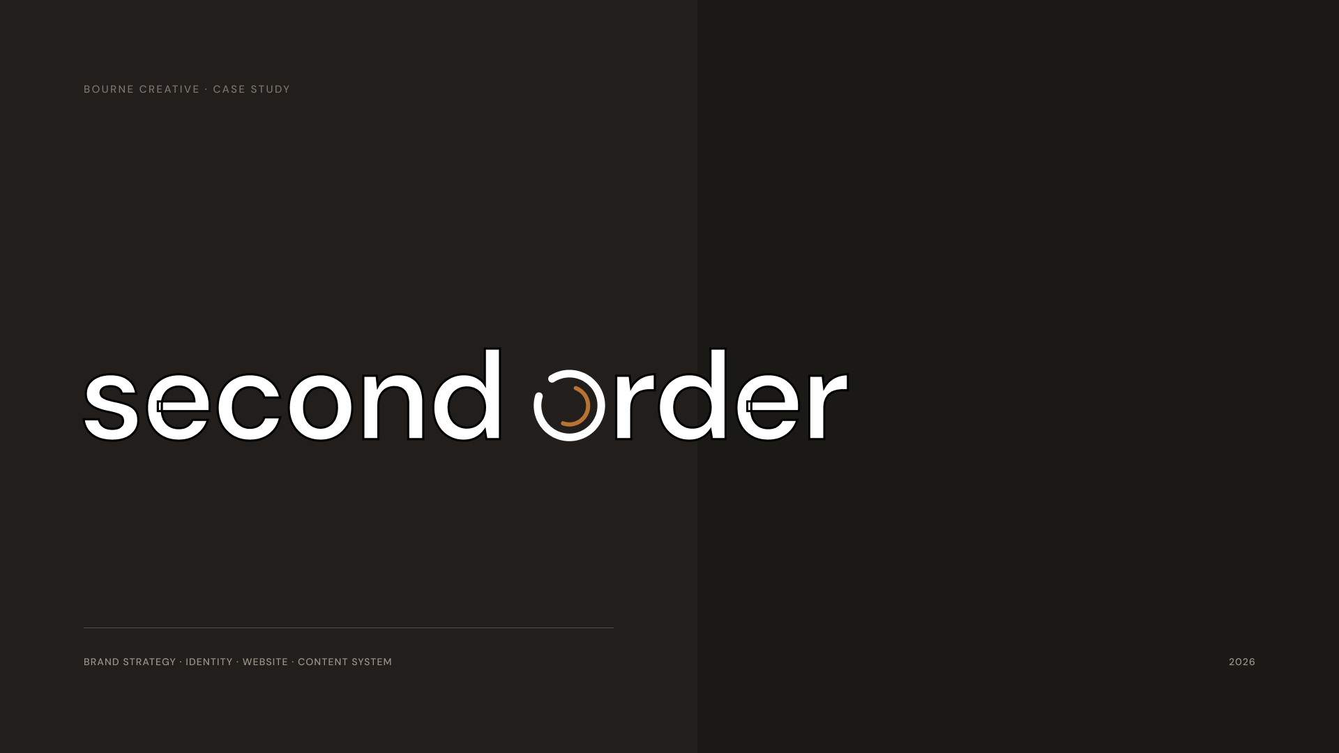
The identity is a wordmark with a geometric symbol standing in for the O. It reduces to the symbol alone below 96px. Nothing is redrawn at smaller sizes, only removed.
DM Sans carries everything from 96px display headlines down to 11px legal captions. DM Mono appears only as a technical accent, in figure references and system labels. The palette is warm neutrals with one working accent: ink, muted grey and warm white, with cobalt blue and copper doing the work.
A website that reads like an instrument
The site uses a dark, technical register. Mono labels, radial reference marks and a single copper accent. It reads like an instrument rather than a marketing page, which is the point for a business selling diagnostic rigour.
The homepage opens on the position rather than the service: stop adding, start understanding.
Four maps, one system
Second Order sells thinking, so the thinking had to be visible. Four master diagrams turn the method into something a prospect can read in a meeting: the B2B Growth System Map, the Marketing Engine, the Decision Journey and the System Clarity Cycle.
Each is built as a component, so every deck, article and page draws from one source. The campaign system works the same way. One idea, five aspect ratios, no redesign.
What changed
Category clarity. Second Order now holds a distinctive position built on systems thinking rather than another jargon-fluent B2B pitch.
One coherent system. Identity, website, diagnostic tool and content all speak the same visual and verbal language.
Built to extend. New infographics, decks and campaigns slot into the same structure without a redesign.
Outcomes were assessed qualitatively at handover. Second Order is one project in an ongoing relationship covering brand, digital experience, content and marketing.
Selected Imagery


“Understand what connects. Then design what compounds.”
Start a Project
